Speed & Power (force)
Take yourself a powerfull hit of speed, then speed through this page right here why dont ya?
The next animation test I did was a yet agian stylised, since that seems to be what I do best, test of power and primarily speed. Agian very simple very basic no big flashy detials just me experimenting with diffrent aspects of animation as my focus for each test.
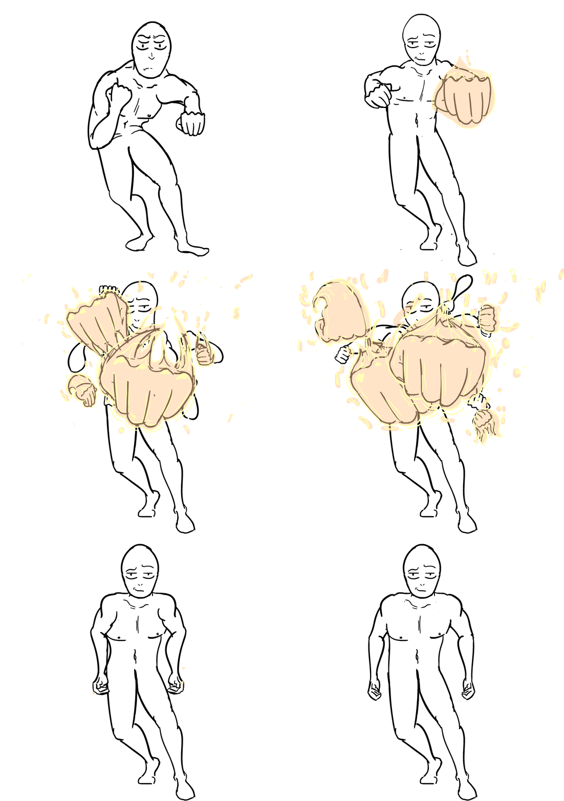
So as you probably read in the title for this page. This test was all about force. i.e. speed and power. I needed to visually represent those two at the same time. With no story cues or context to help, just the action within the animation itself. This Is the finished product. Stylised yet agian, but I'd rather have some memeorable flair then for it to just blend in with the rest and be forgotten. The legs and torso are pretty bare animation wise. They wern't gonna convey the force in the first place but the arms were, so that explains the animation being predominantly in the arms whilst the rest is just to add and enchance the main action. Perfect example of Secondary Action, Follow Through and Overlap. The fire on the fists is added in for fun, flair and due to my inspiration which I will adress shortly. One last thing to keep in mind I'm aware that some parts arn't proportionally accurate as the weight is also somewhat of, but as I said those wern't what I was testing here. So dont judge it on those merits. Speed and power is what you should judge by.
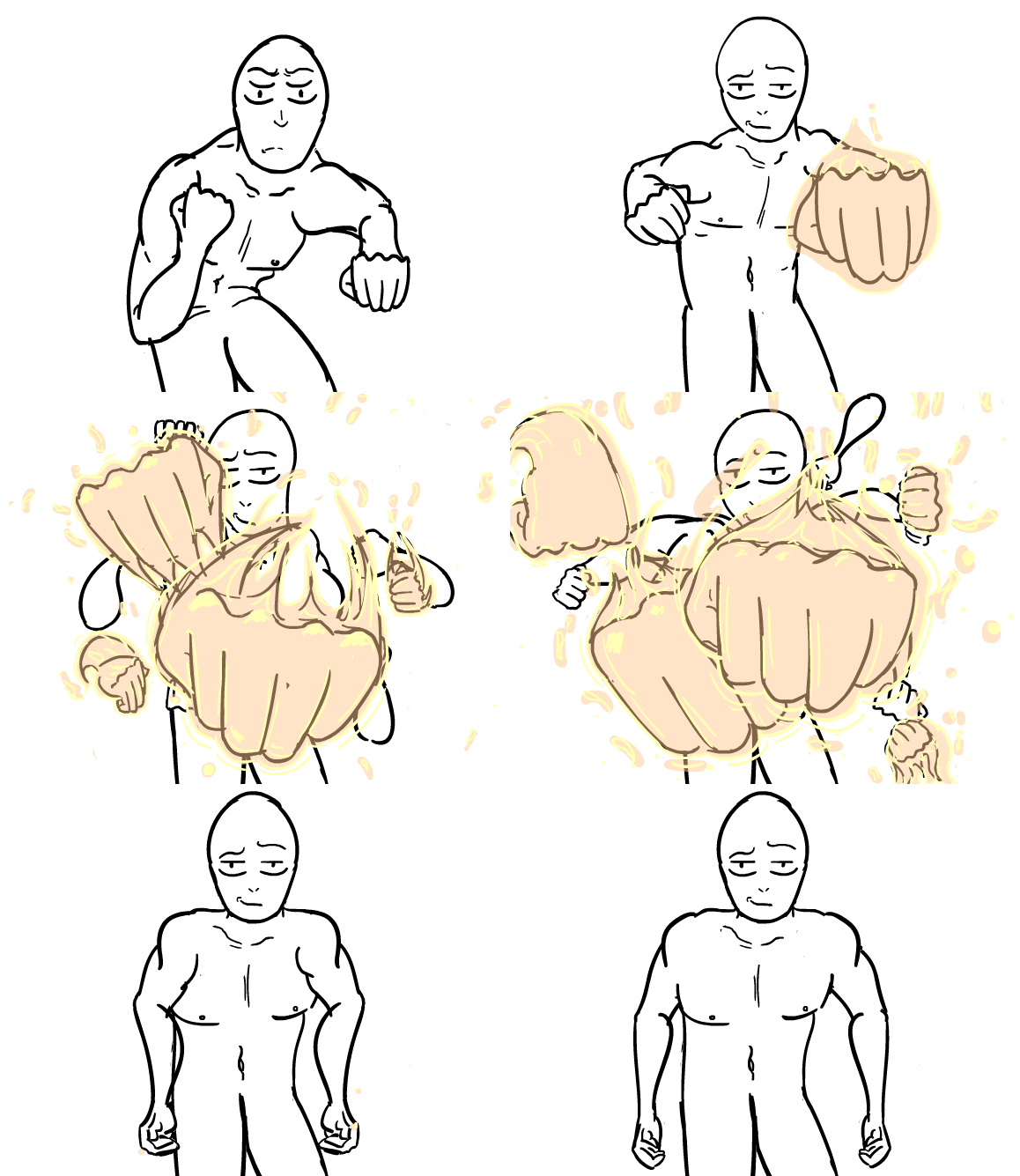
This is just a closer look (mid shot) at the fists themselves to see the animation I did on them better. Since the focus is on the arms and fists and even slightly the torse this just helps to see it better and enhance it. If you will permit me to be critical agian. seeing it now having learned from the experiance. In terms of what I would change. the flurry of fists themselves I would keep mainly the same just maybe change the timing to a minor degree and add more detial on the flames and make the fists more blurred to create a more of a sense of speed. As since when things go faster they proceed to blur out of our vision. the main things I would change would be the anticipation on the draw back of the fists. Likewise the follow through and overlap with the draw back. I'd also maybe exaggerate the arcs and curves a bit more if I wanted to add even more flair?
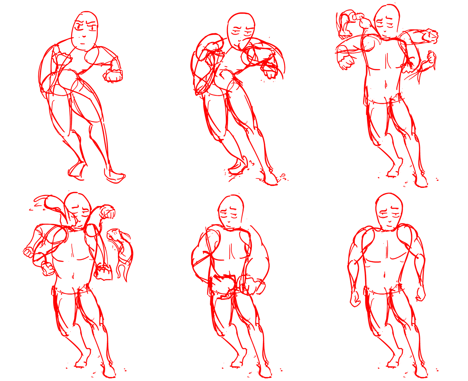
This here is the very intial framing and sketching I did for just the body and arms the fists and flames I will show next. As you can see like with my proportion test/study via practice. The bare bones are there. Whilst it may not have a sense of speed or any form of timing. likewise for the force and or power. The motion/animation in which those principles/visuals will be conveyed is evident.
So now we have just the fists themselves and the flames. I did this and the body speratly as together it gets very hard to ditinguish the two and make out any detail. These are rather simple. Paradoxical considering the hands are some of the hardest things to draw. But I didn't let that worry me. Since they would only be seen for 2-4 frames you wouldn't be able to make out detail. So it would be a waste of time for me to add any. Thusly I didn't need to worry about getting the hands spot on. Additionally if I were to make mistakes it would just add to speed since agian it would just become a bit of a blured visual mess. Counterituative I know, to show speed you have to make your animation look messy. But it just seems to work?

References
This video was the main inpiration I had for this test animation in the first place. Whilst used as a basic refrence I mainly used the show itself more, since, well thats aa straight from the source as one can get. But I found it very helpful to see the way more experienced animator went about the nearly same thing I did.
This is a clip from the actual show itself. Just so you can see how the original property handled the same principle I was following. I mean to a certian degree Hirihiko Araki manga author is partly responsible for this. He helped make this practice in drawing/animating. To use a series of disembodied fists to show speed and power. Its one of things you can link directly back to him, and some other mangakas during mid Eighties to late Nineties.
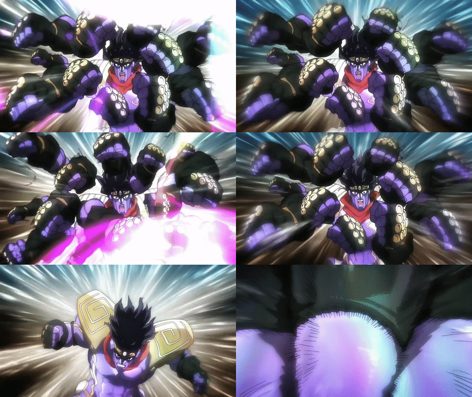
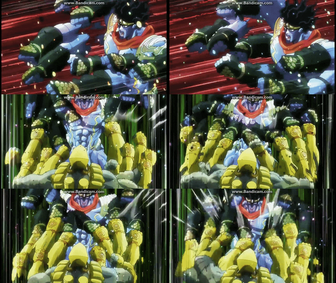
Im now just gonna show some gifs of the titular stand (punching ghost) Star Platinum. Who has become somewhat of a poster boy for the series on the whole. In that he is one of the most ,if not the most, memorable stands of the series. You can really see what I mean by the disembodied hand effect here. You can't even nessasarily see the arms themselves. Just this series of rapidly appering fists going in and out of existence a couple frames a time. The blur applied to them furthers this effect. As do the backgrounds and the character themselves.
Agian the same thing here, but how you can see how those fists in turn interact with another charcter. More disembodied fists which if I were to simplify this method created and honed in Japanese Manga and Anime. thats the two words I would use disembodied fists. The general idea behind it is that since they are moving past percevable speed the eye would loose most of the movment and just get breif gimples. Which in the most part is true when anything moves fast enough. I'm not sure how credible this is but apparently the human eye can see at its fastest and register accordignly about 60 FPS. Even then the Human eye will miss parts as whilst amazing as it is, it cant capture everything.
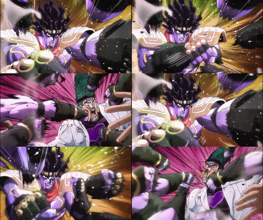
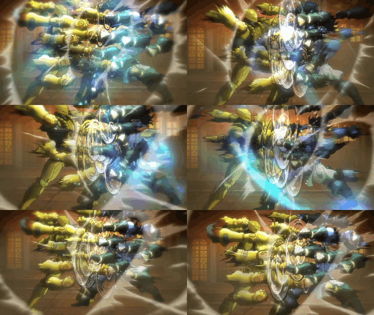
Following on from that. In terms of how I use this knowalge to inform my practice? Prioritising. Not in the sense of time managment or that kinda stuff. In the sense of focus. When you were watching the gifs your Eyes were primarily focused on all the fists and even the arms to a leesser degree. Since they were what was in the foreground. As well as being the only moving things within the shot. so of course your eye is gonna be attracted to centre shot were all the action is going on. It's just how humans work, we focus on the thing that is moving the most and right in front of us.
Here you can see agian a good example of the same technique colliding with itself to give a sense of power and speed. One last not point to add, with the addition of folley in the form of air speeding by and the loud smack of knuckles this will just enchance and solidify the speed and power visual. I didn't add that since im just and animator but I understand how it helps greatly. Following on from this as I get more adept with audio recording which i'm learning about at the moment I will start to use more audio and folly within my work for purposes such as this.

Just one more mange reference of another famous stand from the series.It's the stand of the part seven protaganist Jhonny Joestar, and his stand (which you see here) Tusk Act 4. Suffice to say Jojo's Bizarre Adventure is one of my biggest visual and storytelling inluences and inspiations I have at the moment. and I would highly recommend you to watch and or read it. It is genuinely so unique and stylised and the story is outlandish brazen, wacky and an all out a blast. Just view it somehow. REALLY! Additionally yet agian I just wanna point out the amazing job Araki has done on this manga pannel. He has brought such force, intensity and life to a still image. Even though you can't physically see the movment, you can clearly see it in your mind. Araki certainly makes it clear through visuals what is happanening and how.
Within the anime and manga they don't actually show/animate the arms, or atleast the full arms. They do the Shoulder and maybe the Bicep, or at least part of it, and it will cut of at the elbow in nothingness. This then allows focus and animation effort to be shifted to the multiple disembodied fists. Which since part of the arm is now gone and the fists are dismebodied it gives the effect that the arm is moving past percevable speeds. You can oly catch the occasional glimpse of the animated/muliple fists. Even on the manga page to the left the fists are drawn with such detail and intensity that it looks animated to a degree. The actions are animated not in the literal sense but the charcter is animated in tone. Sidenote I just wanna give credit to Hirohiko Araki for this amazing manga pannel, this one pannel has got so much personality and so much to show and tell you from just this still image alone. So paradoxically by implementing less animation in certian areas and or proritising others. Example being the lack of an arm animation and the focus on the fist animation alone. The force of speed is visually achieved. This can apply to anything to, Not just the arms and fists.

Relevance, reflection, application and future
The relevance here is that even if I am not animating a action sequence or anything with swift and decisive motion I can still apply this theory to a lesser extent to do other motions. For example, just moving a simple arm I can prioritise certian areas over others to enhance the flow and motion withing a limb or body part. With me being a character animator and all this is crucial cuase if I can't animate a character, and to animate a character is to move it, and if I cant move a chatrer then well? Point is this it's really the basics, but me just going from there and enhancing it with some personal flair and making it more intresting and complex then just a basic point A to B.
On to relfection. Seeing how this test progressed, granted it didn't turn out as I thought it would, that isn't to say I don't like the final product. For specifics of what I would have done diffrently? I would of added more exaggeration, maybe more blur? Or maybe even some shaking of the camera itself, or even folley? I also would of used more of the body rather then just the arms and fists. Even thoough that kinda contradicts the lessons I learnt here I feel with the correct application I could of done more with the rest of the body. Additionally I think I would alter the timing ever so slightly to make it even faster and more violent. Lastly I would just give the fire some minor touch ups on the line work.
Next, application. Like I said agian in theory, my other animation tests the application is endless.At least in the sense of if I ever want to make anything or anyone move in my animation I can apply this technique to it and give it a unique and refreshing feel and look to it. This can help me bring new life into anything I may be animating. Additionally it's just another visual asthetic that I can adapt and incorporate into my own libary of stlyes I can use. While not fully there yet if you look on my over the summer work, you can see me practicing this with some still images I made in practice of Araki's style.
Lastly future. Well since I'm gonna be animating characters I wouldn't be able to get my foot even in the door if I couldn't do this and even do it well, and on top of that in a way that is unique to me and hasn't really been done before. While this "style" has been done before the technique is always usefull and as I said I going forawd shall adapt it and build of it to make someting new all together. I shall also be using this in in some way shape and form if not just the basic in every animaion test I do going forward. Maybe not the asthetics but the techniques shall be applicable forever.