Proportion
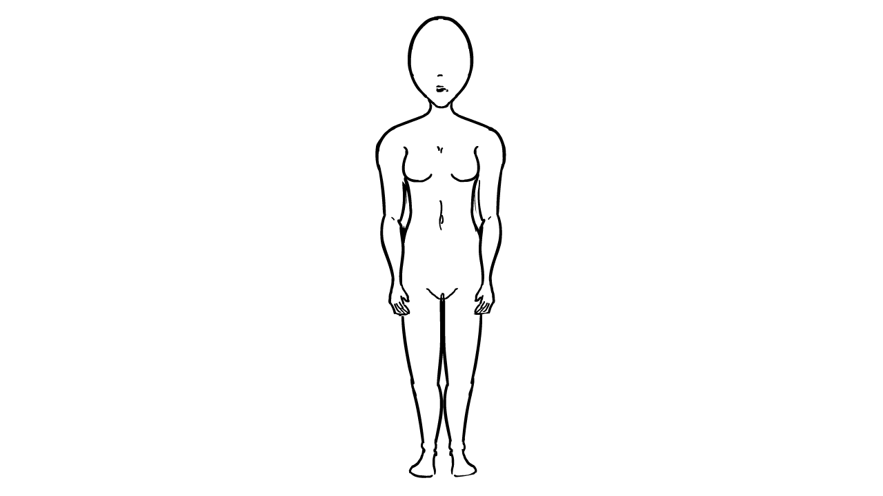
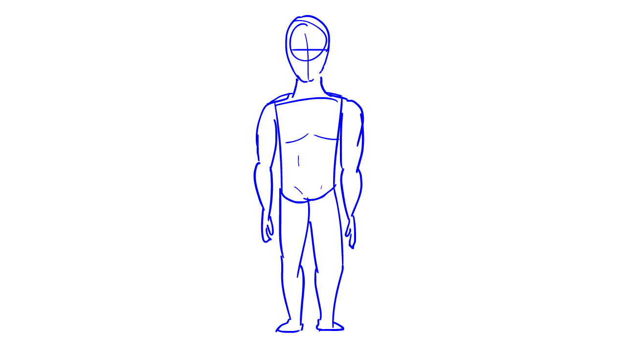
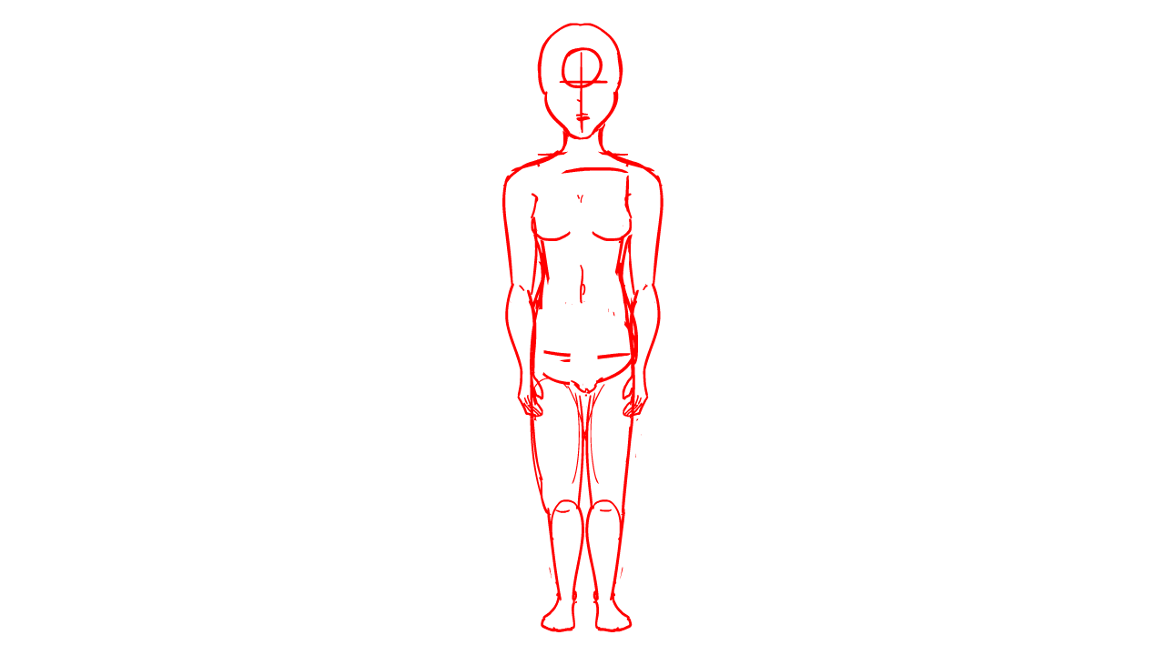
Did I get the cock and balls right? What about the tits?
Over the summer I decided to do some basic animation to keep it fresh in my mind. I decided to just do some real simple Lazy Suzanne turns of the male and female form. I was only focusing on proportion and having a realistic, yet stylised, depction of the human form. A little rough around the edges for sure, and looking at it now I can already see ways I would improve it. Simple. sweet. I made these with proportion and to a lesser degree wieght in mind.

My stylized male peforming a full 360 turn. Permit me to be critical for a brief moment. The shoulders and arms and hands are the things that strike me the most in terms of potential improvment. The shoulders have a slight bob to them. As do the hands, and the arms themselves I feel could be improved proportion wise.
Onto the female 360 turn now. Personally I'd say this one is better then the male one. I can see less problems with it. But still if I were to do it agian or come back to this I would improve it still. The most glaring issue to me is the breasts. As they turn they slightly change shape and position ever so slightly. Other then that I'm rather pleased with how this came out.
No need to do an animatic for this as it would only be three shots. So instead I will show you the first sketches I did for the animation, essentially what I used for refrence for myself as to how to draw the final product, I didn't get any actual refrence here as I couldn't find a naked model turn online, and I wanted to test my proportions base knowlage. This was befroe U used actual fine lines for tone,proportion, etc. You csn see at the moment it's lacking in timing propotionally it can be imporved and it's missing imbetween frames. All par the course, I wasn't aiming big with this. It did the job to serve me as a home made reference. No harm no foul. I hope you can see how it was vastly improved in the finished product.
Same goes for this as the last sketch. One thing diffrent to know about this one. I'm sure you'll notice how this one is alot cleaner and just easier on the eyes overall. That is for one very simple reason, the female I did second. At that point I already had learned from the first one I did (male) and I'd say it clearly shows.
Relevance, reflection, application and future
Relevance of all this being being the fact I am a character animator. If I can't do atleast accurate proportions or semi realstic prorotions, if I'm doing something highly stylised then the chacters I'm animating won't look good to begin with. That's as simple as it gets really.
Secondly we have reflection. Looking back on it. There is vey little I would change. All the things I would change would just be adjusting the proportions to be slighty more accurate. Additionally not that I don't like the timing but i think it would of been beneficial maybe if I made a slower version with an even smoother lazy susan turn. Not that, that would make it better I just belive it would be nice to have a slow and a fast version. Still not like I can't come back to this and do that.
Next, application. Well this will apply to everything I do... forever. If animating a character it has to, if not have ,realstic proportions the proportions that it has been designed to have, needs to be consistent to make the character seem solid and tangible even if drawn. Thusly no matter how stlyised or what ever style I may be using to have the asthetically pleasing proportions and making sure they are consistent will give the charcter so much subtle depth and life that they will be nice to look at and believable.
Lastly future. I shall definatly continue to do tests like this but more complex going fourth. Even in the test that arn't necessarily about proportion every test will need the info I gained here in some way shaoe or form. This is a must have skill to get into the character animator market.