Personal summer work
this is just shit I did over the summer
over the summer I did try to get some of my own shit done. you can see that here. enjoy. I hope you enjoy it cuase lord knows I didnt.
La Squadra Esecuzioni

So as you can see above this was my first basic simple sketch of it, no details as of yet, no need to add it at this point only will complicate things. Hopefully you can see that each figure has a clear cut personality and character despite me not having drawn any real features on them. I personally can see each one is expressing quite different feeling/emotion. at this point I was only getting spacing and overall figure worked out. proportions are kinda there but i wasn't too fussed at this point. they do get better though. I also added in the table so I would now where all my easter eggs/references will go and so I can know how they will interact with the characters. But at this point it has flair, style, not Araki’s yet, and composition.


So for those of you who know me you'll probably realise that I am a huge JoJo's Bizarre Adventure fan. For good reason, its a fucking amazing show/manga I would highly reccomend that you go watch/read it when you get the chance. Anywhore with the part 5 anime adaptation, Golden wind, having finished at the beginning of the summer I wanted to commemorate this part by depicting one of my favourite, and most interesting both visually and depth wise, Villain teams. "La Squadra Esecuzioni" which roughly translates from italian to the execution team. Each member has a clear personality and aesthetic to them and I wanted to show that. Additionally I realised that it had been ages since I've done a full colour piece with shading and extra detail so I thought why not do one of those again? I can do it for my la squadra piece. I also at the same time wanted to challenge myself. know that this wouldn't be easy. I just wanted to do something out of my comfort zone. so I thought what better way to pay homage then following the old imitation is the sincerest form of flattery mantra. I drew in the same style as the author/artist Hirihiko Araki. After all he is known in the mangaka world as having a highly unique and stylized art style. With loads of detail and such. So there we have it my first piece of the summer was a full colour extra detailed piece depicting my favourite villains form part five of Jojo. Lastly, since the entire part of the show is set in italy I thought just as one last visual metaphor, so to speak, to also make it a parody of Leonardo da Vinci's "The Last Supper".


Now you can see I've got all my line, and fine lined work done. So know you should be clearly able to tell this is no longer in my style. well I suppose it is because I'm never gonna match Araki at his own game . So more realistically it's a mash of mine and Arakis. Which was definitely challenging to do for sure. So it did provide a good bit of fun in that sense. Araki's style is known for a lot of extra lines & shading. Sharp edges and thick and bold lines. Exaggerated proportions yet they are still visually appealing. No other is like araki truly. Anywhore all the basic line shading is also done at this point. You can definitely also notice that I have added all the various "props" to the table. Now I realise with only lines what those items may be difficult to discern, but when colour is added I feel it becomes fairly obvious as to what I drew. Also know I think most importantly that the lines are all done and each character has their individual features you can clearly tell their emotions, and quite emotive they are. all showing their individual personalities. The man on the far right is quite clearly yelling in anger at the rest of the group. The one taking the centre stage is experiencing sadness. it should also hopefully be more clear to see the parody of the last supper now. See I even added jesus light rays to the central figure. each item on the table was placed their due to plot relevance and such. So I wasn't just picking random things they all are appropriate. But yea I’m really happy with how the lines came out given I was challenging myself with a style that is quite different from my own. Still though all in all it proved a fun challenge and good practice and I am quite pleased.


And here is the glorious final product that I am very proud/pleased with. It all came together in the end despite me thinking it would be over crowded. This truly is a piece that is bigger then the sum of its many parts. It took some time for me to make this I'd say somewhere between a month or 2. I feel it would've been considerably quicker if I was doing it in my style. however I would definitely say I have learned from this. Each character is very expressive and fun to look at. Each tells a story. The colour scheme took me sometime but I feel I finally got it just right. With enough contrast and complimenting colours. The composition hasn't changed since the beginning and since that is a direct parody of the last supper I’d say Ii hit the nail on the head. You may notice the background being quite basic. That was intentional as I felt if I also had a really detailed background it would become difficult to separate the foreground and midground and background. The background while basic works though for sure. The colour shading whilst minimal is their and just adds to the lines shading I used. the line shading speaking of was mainly just hatching and some cross hatching. I hope at this point you can tell what each item on the table is. Even the smaller ones. lastly I wanna speak about less the visuals and more the emotions and characters themselves. You can tell from the placement and the way I have them interacting with each other that they have an intricate and long lasting relationship. On the left you have the clear lovers. You have two play fighting and you also have two displaying brotherly relationships. so yea this is my Jojo's piece that I used to challenge myself and try another style. I also used it to improve my colour and detail work as well as composition and proportion. and I have learnt.


Gay spiderman
So now this is not a thing in planned or intended to do. It just sorta happened? It still is happening on account of it still being in the beginning phases but I shall at least show you what I have of it so far. So you may be asking what on earth I’m talking about. Well some point around mid summer when the whole Marvel vs Sony spiderman rights debacle was going on at the same time some minor controversy was being stirred up. I say controversy in that it wasn't actually bad or anything its just people being people, say anything that some may consider offensive or what ever and there will be those offended by it. So the controversy in question was current spiderman actor Tom Holland said something about the potientiall for the character to at some point be gay. As comic book heroes often change their looks and stories. Nothing new here. Anywhore me and my mates were talking about this and one of em sent a crudely drawn picture of Tom Holland Spiderman kissing Andre garfield Spiderman. I was disappointed. I thought so much more could be done off of the prompt "gay Spiderman" So I then decied to make a gay Spiderman animation. No speech or whatever simple style basic but fun. This was only done for the fun of it. No me testing out stuff or setting a challenge just pure unadulterated fun, and that's what your about to see. Like I said it is nowhere near finished but see if you enjoy what little I have of it so far.
This is the scene that I’m basing it off of. I hope that you have had the pleasure of watching the Sam Raimi Spiderman trilogy. As to this day its the only spiderman series that made it to a third film. Anywhore they are truly something special and this by far to me and many others is the most....memorable scene from the trilogy. I’m not the first one to parody this either so many references have been made to this scene and the Sam Raimi trilogy in general since its release. So know that I’m parodying just the parts where he is dancing on the streets of New York and not any of the other parts. As the dance really it what makes it, and it's what your gonna remember. Saying that from experience.
As you can probably see it is still very much in its adolescence so to speak? I have got a lot of other stuff I plan to add to it as time goes on. something different I suppose worth mentioning about this is that i'm not gonna make a written plan. No storyboards or anything that we have been taught to make. This is literally just no holds bar whatever. I’m not gonna bog myself down with getting stuff looking right. The only thing in my mind that i'm gonna be paying attention to is whether I find it funny. As of current, I do. I have a lot of things to add but since I don't have a checklist I can't really say when I think it's going to be done? if it ever gets done that is. I’m being very relaxed about this taking my time. I’m just doing this for enjoyment and peace of mind really, I think it shows. That doesn't mean others can't enjoy it though. Plus all effort going towards this is good experience. so yea. gay Spiderman.
basic tests
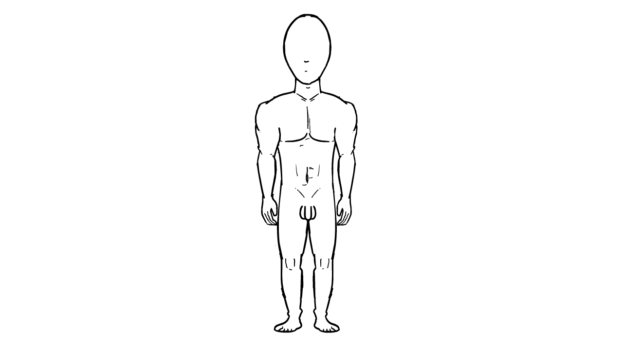
So now we get onto some quick test I did over the course of maybe 4-5 days? Roughly? Give or take. Anywhore there are a long list of other tests I plan to do to eventually be able to add onto my portfolio. I’ve learnt that something simple like this male rotating to your left takes about 2-3 days. so let's be generous and say a basic single test takes 3 days. Anyway onto the test itself. a male figure standing straight rotating on the spot. I feel for the most part it looks solid. I can spot some things though. I think the shoulders are the most glaring, they bob up and down. I didn't notice that when making it. But that would be something I would correct. As well as some minor alterations to the back and the legs and arms. The head, torso, ass and genitals are rather spot on I'd say.
You may notice this one is going a lot faster and is in red. that's for the sole reason that this one isn't actually finished yet. But like my gay Spiderman peice I thought it best if I at least show you what I have so far. So as you can see I haven't been doing nothing over the summer. Funnily enough I think the proportions of the lady, I have done better than the man. I’d even say I find ladies in general easier to draw? Just ever so slightly? I don't notice a problem with the shoulders this time round. so obviously I have learnt from the first time. It's missing some frames for breakdowns. but you can still get a clear turning motion. Of course when I’m down with the frames I'll slow it down as to allow you to actually see the minimal detail that's on the body. I think I still need to work on the breast and the feet on this one. But like I said it ain't complete yet I so can get
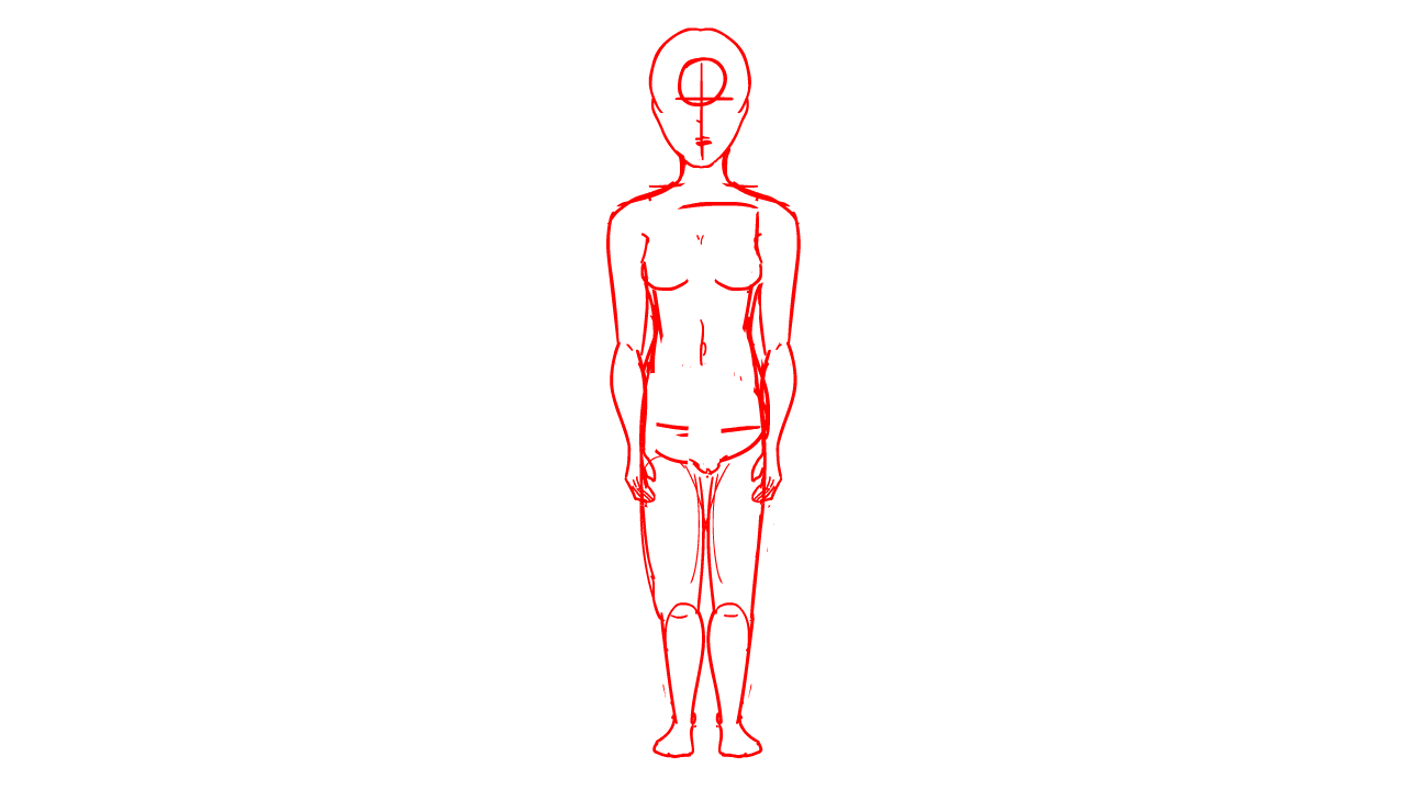
to that whenever I want. even if I don't not like I can't come back to it even after completion to make it better. Lastly once I’ve added in all the remaining frames I'm gonna need to go over it all with smooth black line. like the first one.
animated music video - pre production


Now granted this isn't something I started this summer but it is something I have picked back up this summer. what this is, is probably the biggest scale personal project I have got going on at the moment. I started it last summer between first and second year. didn't finish it didn't even get close. then again I wasn't planning on finishing it last summer so no biggie. But I thought I may as well start cracking at it again this summer. again I didn't plan to finish it this summer just to keep the ball rolling. All this is really me wanting to make an animated music video. That’s just visually and thematically creative and explorative in my own unique style. If this goes well when it's all finished I may make another animated music video? But cross that bridge when I come to it. so to begin with I had this idea that I’m still running with. There is a massive house party going on in the middle of the woods. we follow our nerdy teen protagonist as he enters the party and begins to have fun. As the party goes on strange stuff starts happening and suddenly everyone except for the nerd and a group of girls turns in animals. it is revealed then that this group of bitches you have seen earlier were actually a group of witches. do you see the world play? We then see out protag begin to turn into what we assume to be a dog. twist he's a werewolf and he eats the witches in retaliation. I’m not doing the plot justice but that's a summarised version. Above you can see the first things I did some basic concepts for the party. As that is where the majority of the video is taking place. They are just some different rooms and the outside of the party. Since these are just concept work I kept em simple and sketchy and tried not to go in on the details but I feel it definitely captures a light hearted atmosphere with some mysticism thrown in with all the lights and bright colours and shit. So if I’m honest this concept art and potential backgrounds for my video may be some of my favourite things I have so far made for this project. I haven't come up with a name as of yet, so it's just being called the animated music video.


Here you can see my concept for the protagonist of the animation. I’ve kept it a basic, simple and relatable design. It's not meant to be anything flashy it's meant to look like someone you wouldn't really notice. Unassuming I’d say would be the best fit. That's for the simple reason of surprise. *SPOILER* its a twist that he is infact a werewolf. You can see the first draft for that on the right. it's not as intimidating as I want it to look. I need to up the scare factor, any way a work in progress. You can see a basic emotion sheet. you know, now that I look at it he may be subconsciously based on Shaggy? I also added a basic colour palette. So yea my anonymous protagonist. One last thing to keep in mind is that this initial character design was done during the last summer so it is something I am definitely looking to update when I think of things to do to improve the overall design. so if there is one thing to be said its not final.


Now onto the main antagonist. This is the ringleader of the coven of witches that are our stories antagonists. All my designs are of adolescents/teens since in my head I imagine this being an after school house party. The kind you expect to see in American teen drama movies. First thing to note is that you'll be able to see that my main inspiration for her, she just goes by witch, is Eclipsa Butterfly from the Cartoon Network show Star Vs The Forces Of Evil. I just really liked her aesthetic. I just imagined if she was a teen in American high school, and just made her more emo. So yea, rather simple process really. Out of all the designs besides the environment hers is the one that I would say is the most complete. She doesn't have an emotion sheet but I do definitely intend to make one for her. I particularly like her colour scheme, and if I make any changes to it it will be minor. Her design I also think the same. if I am to make changes to it, it won't be much just enhancing the overall feel it generally has I’d say.
Next we have the Pixie design. Now you may be thinking Sam, Pixies what the fuck? Sounds quite gay. And yes maybe. But the reason behind them is for story purposes. cause, with me saying that I may do another animation if this music video goes well. If I do that, my idea was for the music videos to be like an anthology. So each having a different enclosed story with their own characters and setting, but to have each story be in the same universe. Think shows like Black Mirror, Inside No#9 that kinda stuff. The main linking point is at the end of every music video you would see these Pixies appear from nowhere and bring the animation to a close. Or something like that? My heads a little fuzzy on it if I’m honest. I just thought since it's gonna be an anthology I need something clear connecting each animation. Showing it’s in the same universe besides shit in the background that only avvid eye observers will notice. But yea Pixies.
Also we have these alternate designs I made that I will probably mix and match between. I feel the design of the pixies will be highly varied per episode they will be really crazy and random to. No one will be the same. Like snowflakes.
I based this main design off of Pix from Riot Games League Of Legends design isn't final though so expect some changes to make it more unique.


Now onto some basic background characters. Like with the characters before hand you must remember that these are meant to be between the ages of 17 - 23 so late teens to young adults. I’ll just give a very brief one to two sentence summary or so for each one. First dude, Fat chubby man with no real neck and big chin. Got some lovely peach fuzz stubble and wears t-shirts and shorts. Next dude skinny little ginger lancky cuny aint he? He a pinger for sure, If you can't tell. Very thin hair with goatee and wearing burning man clothes. Also just thought I’d point out the lovely vest design of "calipornia creamin". Ahh the fun of being a youth. And burning man.
Now onto these two lovely ladies here on the right. First women wearing some form of seqan party dress. So it's always sparkly basically. Long black flowing hair. Got high heels and a need for wheels, inked up with a dragon tattoo. Cliche I know but she just is. Onto the second lady. So he we have a more casual party get up she is just in a shirt and jeans. With her, her trusty purse by her side. She is obese, with no real chin/neack got shoulder lengh light brown hair. full makeup and big luscious eyes. also has a nose peircing cuase fuck society.


So lastly we have this fucking jock of a man. he's obviously based on the classic high school jock stereotype but at the same time he is actually a really chill and nice guy, despite his large intmidating figure. Like if this dude was real he'd be at least, like, 6 feet tall, it's ridiculous. anywhore the complete “BRAH!” has a camo pattern shirt. With a admittingly bad style choice of a hawaian tribal tattoo on right arm. Wearing some brown Chinos or something like that, the point is they are light brown. Also got on some old beat up sneakers, lip piercing and sideburns combo.
So on the whole you have these side characters plus more that I have come up with to fill the house party. Each of these peeps won't be on screen for longer then maybe a couple seconds at a time so they are meant to blend in with one another. So I hope that they are forgettable in that sense. Since they are just background characters after all. But regardless I still needed to make sure that they look like they belong. I feel they do. These are some of the sorts of people I can imagine I would see at a party. Just like about the place. wouldn't necessarily talk to them but I’d know that they are there. These I don't feel need to be changed they hit the two criteria I had for everyone. Look like they belong, but at the same time be completely unassuming. These are also the guests that turn into animals and I have even got some of those designs done. but I can't show you everything I have made less it takes up your whole night. but yea background characters.
So now we get onto the real meat and potatoes of this project I have going on the side. This is my story board, or at least what I have of it so far. I'll give you a rundown of what happens. So it starts off with a POV shot from our protagonist. He is in a deep woods and it’s night time with the light from the moon counting the forest in a surreal glow. The beams of moonlight are breaking through the trees to illuminating certain fauna and shrubbery. We can see that our protagonist is walking as he passes along the trail. We hear and see wildlife all around. Suddenly you see a girl enter from screen right, looking back at our protagonist she extends her arm as he goes to grab it he is taken away through the forest at some speed with the wind blowing by. The screen reflects this with the trees quickly blurring into one another as we slowly come to a stop when we see electric light pierce through the trees. We stop to reveal a house in the middle of the forest with a party raging inside, this will be an extreme wide shot in comparison to the previous wide shot. People are all over the place drinking, drugging and having just overall fun, it’s quite crazy. It cuts to a another wide shot at a dutch angle. And it's no longer a POV. We see our protagonist fist bump a friendly dude on the way up the pavement towards the house. It cuts to an over the shoulder shot as he approaches the door. It then cuts to another wide shot of the side of the house with two randoms outside as one is consoling the other as they puke. All the while some other person is smoking out the window all with the party raging inside. You can see our protagonist in the background heading towards the front door of the house. Next we cut to a mid shot of the inside of the house again through the window our protagonist draws closer. I’m constantly keeping the protag somewhere in frame to sneakily get in the viewers mind that they need to always keep an eye on the protagonist, there's something more than meets the eyes basically. Alluding to the twist. Anywhore mid shot of people partying, suddenly a dude runs towards the window and jumps out of it smashing through it and falling. Then raises on the other side seemingly fine and giving a victorious scream. It then cuts to another POV shot this time from the witch as she walks behind our protag in a mid shot. It then cuts to another mid shot with the


witch shoving past our protagonist not even acknowledging him since she is a bitch. I mean I did say that before. Our protagonist just stands there in shock as to their surprise a hoard of followers, fans, groupies and hormonally driven teenagers flock past out protagonist knocking him over as he weakly tires to defend himself. As the screen shakes to give an almost humorous and exaggerated effect of the crowd making it seem like a stampede. Well that's all I have right now I’m mainly focusing on long and wide shots to really show of the scenery while its outside however once its inside we shall be moving to more mid shots and close ups. as you can say I have made little annotations and indicators of stuff like pans, shake and etc. you will also notice the blue text under every panel those are the lyrics of the song as I’m in the process of matching up visual wit lyrics and the timing of those. I’m still playing around with it. But yea that's what I have of the storyboard.
rick and morty parody
And now finally we come to something that I technically didn't do during the summer. but I still feel it can more than contribute to examples of my 2D work. And go towards portfolios. This is my rick and morty collab animation or at least my part of the colab animation I made for the connected set during the final term of my second year. So I’ll just get right into it. This is the animatic I made from the storyboard that I got approval from both Liam and Mike. As you can see at this point I wasn't using colour, why would you for an animatic? Unless you want to specifically make note of something. I feel this animatic is rather good at showing what I wanted to achieve and seeing it after awhile I realise that from start to finish that they must have loved my idea because it remained mainly unchanged.
Now we have the second iteration of my piece. This time it's an actual animation using adobe animate. I was still in the process of blocking and even lining. I must apologize for the compressed audio that's cause of flash. Anywhore I had made the complete background and had finished my first pass and even most of my second and I was starting my third at this point. It's mainly just the breakdowns/inbetweens at this point. I had also, at that point, got a majority of the timing down. Likewise my composition was sorted from the get go. Lastly I had started to colour some of the props. so at this point it really is the mid way till the project is finished.
So yea here you have the final complete animation for the connected set Rick and Morty collab parody. Mouthful I know. Anywhore all complete now. Colour added. I didn't add shading since I would've missed the deadline if I even attempted it. But full colour though. So you know look on the bright side. All the inbetweens and breakdowns are also done at this point. Some are smoother than others granted but I still feel each does pull its weight in the end. All secondary action is done as is all the lip syncing. Ane thing though I must admit I do notice only now is towards the end, for one frame or so the arms aren't in the correct location but that just one of those mistakes you don't notice until you come back to it months later. So I’m not surprised since this nearly always happens to everyone.